- ProjectBranding
- ClientPieps
Austrian Avalanche Experts
Always Powder with PIEPS
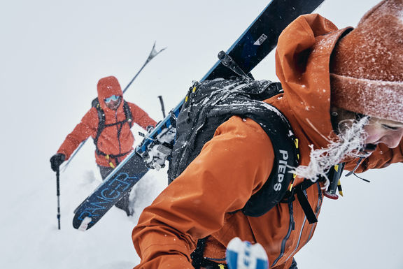
PIEPS is a word synonymous with avalanche safety. So much so, that in Austria it is often used as a stand-in for the word transceiver. They have been engineering transceivers, shovels and probes as well as avalanche airbag backpacks for well over 40 years. Based in Styria, between the city of Graz and the Alps, PIEPS are a stalwart of the Austrian mountain safety scene.
Pieps and zooom
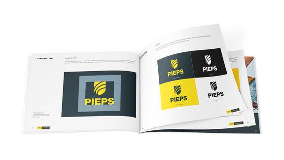
When the Austrian avalanche equipment experts approached us to do a rebrand in 2020, we jumped at the chance. Many of us in the zooom offices are end-users of avalanche equipment, so PIEPS was a dream client. The goal was the modernize and rebrand them for the next 40 years and onwards. We wanted to reflect the innovation of the product selection in the colors, corporate identity and new logo.
Clear Coloring
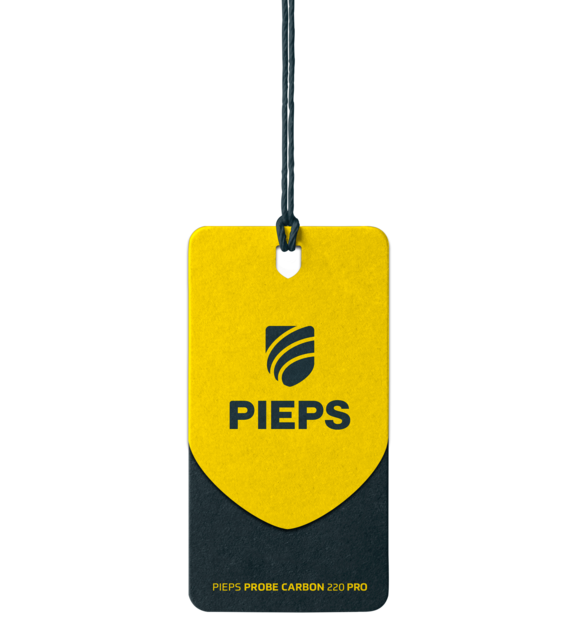
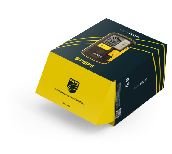
We started with the striking PIEPS Yellow, a highlight throughout the collection. The assets were from there linked to clarity and security. A clear, easy-to-read font and colors which complemented and highlighted the PIEPS Yellow. For a logo we looked at what skiers and snowboarders really want, why they go off-piste into the backcountry. The perfect powder turn is heaven for us riders. We celebrated the perfect turn with a clean, clear logo integrating the lines left in the snow. Finally, we updated the packaging and instructions of PIEPS’ new and updated products. Clarity was key here, as there can be no ambiguity with life-saving products.
New Horizons
With new assets, logo and a new corporate identity, PIEPS are ready for another 40 plus years saving lives with innovative products. We at zooom, are excited for where our new relationship leads us in the future!
All images are copyright by PIEPS

LIKE WHAT YOU SEE?
LET'S GET TOGETHER
We’re full of ideas and ready for any challenge; no matter how big or small. Jump onboard and together we’ll make great things happen.
You in?

